Let’s face facts, mobile and tablet browsing is increasing exponentially, users are not only using mobile devices as their first point of internet use while on the move but they are also now choosing to use a mobile device or tablet as their primary source for all Internet use. With Internet users becoming more savvy with technology and with over 80% of Alexa’s Top 100 sites now using a responsive design, isn’t it time you responded to the needs of your visitors?
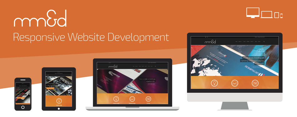
What is Responsive Web Design?
Responsive design is a technique that creates websites that react to the size of a user’s screen. Responsive design optimises a browsing experience by creating flexible web pages, optimised for the device that is accessing it.
Why should I have my site designed in such a way?
Traditionally sites have been designed with a PC or Laptop in mind in the first instance and Smartphone or Tablet second, with two separate sites designed for both platforms, meaning in some cases two different versions of the site exist and two sites may need updating, meaning more time spent working on updates & design. With responsive design this is not the case, one site is designed for use across three platforms and the site reacts to whichever device it is being displayed on.
Using a responsive design now also means that you have to spend less money, time and effort designing and developing a separate mobile version of your website, meaning you can use that wasted resource on something else.
With a responsive design you also don’t lose out on your precious SEO Rankings by developing a separate application to run your site, the application isn’t listed on the web and wont count towards any of the hard work you are doing on your SEO. A responsive website is always on the web, regardless of what platform people are viewing the site on, meaning all that hard SEO work is not lost!
The numbers don’t lie… did you know that?
- Data suggests that over 56% of people now have a Smartphone
- 50% of the average global mobile web users now use their mobile device as their primary device for internet browsing
- 52% of people that use a tablet, prefer using it to browse online and shop online than they do on a PC/Laptop
- 57% of visitors would not recommend a website if the website had a poorly designed mobile version
Responsive design allows you to stay ahead of game. As the demand for sites that can be viewed seamlessly across different platform grows, and with the increase in Tablet and Smartphone use, responsive design is key to keeping one step ahead.
How can I get a responsive design?
There are two very simple routes you can go down when looking at applying a responsive design to your site and here at mm&d we have decided to make it as stress free and simple for you. Don’t worry, we understand that you might have just spent thousands on a new website that hasn’t included a responsive design, we can apply a reactive design to your current site using your current content and imagery, with prices starting from £350.00.
If your site is in need of a full re-design we also offer a complete new re-build of your current site with prices depending on the specification of the development.
If you would like to talk to us about your website requirements please don’t hesitate to get in touch.


